BAGAIMANA - Membalik Gambar
Pelajari cara membalik gambar (menambahkan efek cermin) dengan CSS.
Gerakkan mouse Anda ke atas gambar:
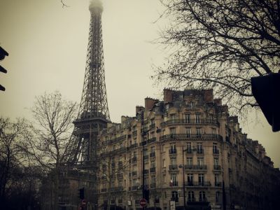
Cara Membalik Gambar
Contoh
<style>
img:hover {
-webkit-transform: scaleX(-1);
transform: scaleX(-1);
}
</style>
<img src="paris.jpg"
alt="Paris">
Catatan: Contoh ini tidak berfungsi pada tablet atau ponsel.
Tip: Buka Tutorial Transformasi 3D CSS kami , untuk mempelajari lebih lanjut tentang transformasi 3D.
Gambar Balik 3D dengan Teks
Pelajari cara melakukan animasi 3D flip gambar dengan teks:
Paris
Sungguh kota yang menakjubkan
Langkah 1) Tambahkan HTML:
Contoh
<div class="flip-box">
<div class="flip-box-inner">
<div class="flip-box-front">
<img src="img_paris.jpg"
alt="Paris" style="width:300px;height:200px">
</div>
<div
class="flip-box-back">
<h2>Paris</h2>
<p>What an amazing city</p>
</div>
</div>
</div>
Langkah 2) Tambahkan CSS:
Contoh
/* The flip box container - set the width and height to whatever you want. We
have added the border property to demonstrate that the flip itself goes out of
the box on hover (remove perspective if you don't want the 3D effect */
.flip-box {
background-color: transparent;
width: 300px;
height: 200px;
border: 1px solid #f1f1f1;
perspective:
1000px; /* Remove this if you don't want the 3D effect */
}
/* This
container is needed to position the front and back side */
.flip-box-inner {
position: relative;
width: 100%;
height: 100%;
text-align: center;
transition: transform
0.8s;
transform-style: preserve-3d;
}
/* Do an horizontal
flip when you move the mouse over the flip box container */
.flip-box:hover .flip-box-inner {
transform: rotateY(180deg);
}
/* Position the front and back side */
.flip-box-front, .flip-box-back {
position: absolute;
width: 100%;
height: 100%;
-webkit-backface-visibility: hidden; /* Safari */
backface-visibility: hidden;
}
/* Style the front side (fallback if
image is missing) */
.flip-box-front {
background-color: #bbb;
color: black;
}
/* Style the back side */
.flip-box-back {
background-color: dodgerblue;
color: white;
transform: rotateY(180deg);
}